BRAND IDENTITY-WHITE RABBIT

- Start up in Shanghai
- 1959 start to sell
- The business man tried the UK’s mike candy
- First they used the red mickey mouse packaging and call ‘ABC mickey mouse candy’
- The milk candy is covered up by thin rice paper, which is a very chewy cylinder candy.
- From 1950 it change to the jumping white rabbit packaging.
- From the start it only produced 800kg white rabbit per day
- It has a slogan ‘7 white rabbit equal to a cup of milk’ Say what this means
- Till now, The white rabbit company is still the first company of the candy brand
- In 2004 it covered 40 or more country in the world, with more countries as importers
- Until now the packaging has not change at all.
- But it has added more taste (flavors) like coffee, toffee, peanut, fruit, red bean and more
- The white rabbit trademark is under GUAN SHENG YUAN
- White rabbit have already sold 14.6 billion
- In 2008 the formaldehyde problem had a big effect on the white rabbit company, and the entire product was withdrawn.
- The entire factory stopped output and stopped selling. They also recalled back all the products.
- It has a lot of cross over with other brand such as hand cream, lipstick, perfume and ice cream.
- The white rabbit is using the newest design, it have use the stamp Anti-counterfeiting technology. On the rapping paper it had 4 red straight line and on the inside straight line it have anti-counterfeiting miniature text.
- Between 1958 to 1962 that time mike is only supply for the baby and the lack of nutrition people can order. So some people think to add milk in the candy, then soak in the hot water so it will change to the mike. After many people try it have a sentence passing around by people ‘seven white rabbit can change into milk’.
- Before the package is a mickey mouse but people think that is came from American it shouldn’t on the Chinese brand, therefor the company hire the shanghai art company to design a package and a logo for them.
- The jumping white rabbit it might means that jump over that three-year difficult time. And the white represent the hope and clear, also milk is white it tells the parents the candy is full of nutrient and healthy.
- Rabbit is cute and tiny, is a animal that child like and it might catch child attention.
ADVERT ANALYSIS
At the bottom of this adverting, it has a sentence ‘Air pollution is the world’s largest single environmental health risk’. This means air pollution is affecting our life and daily life. A statement designed to shock
On the picture is a medicine package but in the box just clean air, on the bottom of the package is an arrow pointing to a word extra clean, the word extra stands out to show a different meaning from the other. And is like the medicine to people, in a box got 30 air unit each day take one. So is suggesting that air is in short supply dues to poor air quality
The package is white, which represent s clean and purity. Inside the box is yellow it means dust and dirty.
Active Ingredient: oxygen, that is pure and fresh air no other extra material. In our daily life there is so many different like Nitrogen, Carbon Dioxide and Carbon Monoxide.
The USP for this is nowadays the air is not really good mostly is polluted by smog, so the air is the medicine is saving our life. And usually no one is taking in oxygen in tablet, but oxygen is what we need to be survive. So the adverts USP is that our air is not clean and so it is like we need medicine to keep us from being unhealthy ‘Our daily dose’


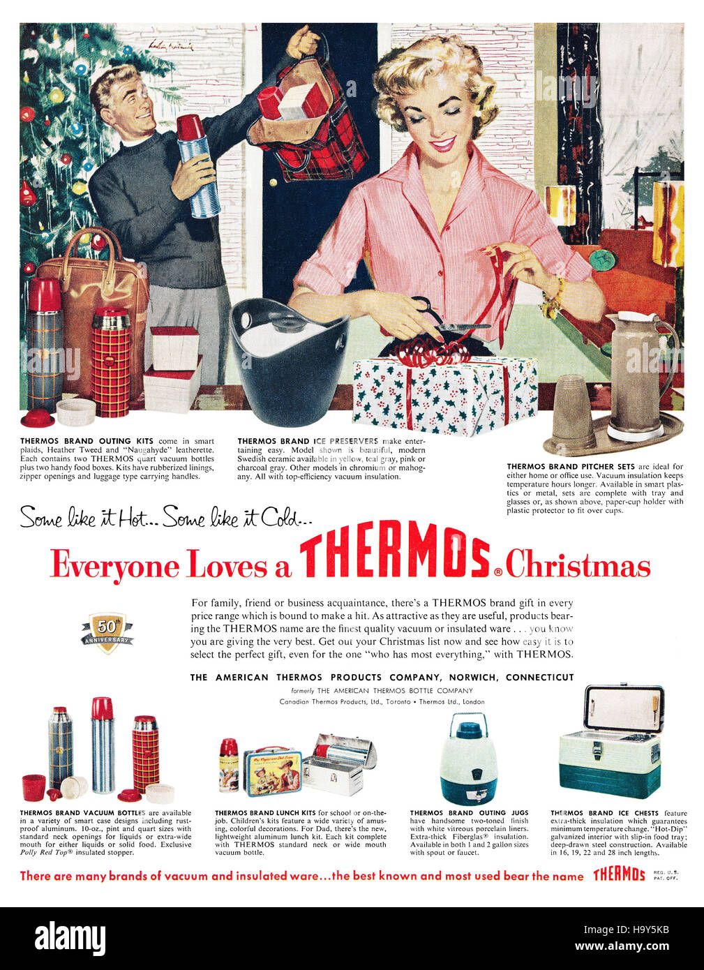
This is an electrical and pots advert. This advert is in 95 century, the type of drawing is about in 95 century. Probably 1950s. So 20th Century
The advert is using the slogan ‘Some like it hot.. Some like it cold’ this is the movie which Marilyn Monroe had play is has a meaning sexy like Marilyn. The women in the advert is looks like Marilyn is doing housework and packing the gift for the Christmas also she seems really happy to do it. This shows the women in the 95 century is staying in the house and be the house women and taking care the child in the house. At the back of the women it had a man holding a bottle, the advert want to say the bottle is like Marilyn it attract people and is sexy as Marilyn all the people love it.
This advertising is for the Christmas, so it is a gift advert. Telling people is a good gift in the Christmas. At the bottom of the advert it have show some other product it means is good for gift is well.
On the Visual cods the colour in this advert is mainly using the traditional Christmas colour red and is a special design for Christmas. Colour red it can easy to attract people’s attention, also red is a lucky colour.
The unique selling point of the Thermos is the design of the pot and the differently from other brand. The customer group is focusing on the Middle age and more older people. In the connotation the technology of Thermos had in that period in 95 century, is selling the product to the people in the factory and hospital. Because the people working in the factory and hospital, they had a long working time, and they don’t have a regular working time so they need a container that can keep the food warm so they can still have lunch or dinner they bring from the home. In the advert the dressing of the man and the women is about middle class, the men is wearing like a suit and a jumper, also the women is wearing a shirt, with a delicate make up.
https://c8.alamy.com/comp/H9Y5KB/1959-us-advertisement-for-thermos-flasks-H9Y5KB.jpg

In this advert there is a black and white photo, with a women and man kissing. In this advert it shows that is raining and standing by the road a car had drive by them and the water has splashed up. But it feels like they don’t really care about it. And the kiss it seems like they had put all the love into it. This is an engagement ring, it uses a design called six claw inlay, this is the classic design from tiffany and also is the design owned by tiffany, this can show the best view of the design. The World’s Greatest Love Stories’ this is what every women dream for and this is the idea of Tiffany design for. Wish every women find their true love, since 1837. The language cod had point to the love stories, tells the people that when you had this ring you will find your love stories is well, but love stories had so many different kind of idea, just like Romeo and Juliet. On the visual cod the diamond is very attracting the girls which is wishing to had a pure and romantic love, every women will want a diamond when they get marry. The ribbon behind the ring it shows the ring noble and harmony. Also the clear ribbon it shows the love from the diamond is truly pure and clear.
Tiffany&Co this brand is represent love, or forever love. Tiffany’s design idea is full of American characteristic, simple and sharp lines shows the calm and transcendent clarity and breathtaking elegance. In each tiffany&co product it shows the concept of harmony, proportion and organization. The concept of love, beauty romantic and dream all this topic meets the fantasy and desire of all the women in the world. Every women will want pure love and romantic. Also the tiffany blue is own by the Tiffany company. So this is the USP and ESP. Just state these ideas.
https://i.pinimg.com/originals/63/8b/70/638b70939e71ec921392757b15e1c551.jpg
BREATHE IN BRIGHTON CAMPAIGN
This campaign is the first start-up in London, and this is aim at environmental problems.
Base on air pollution that effect to the children and the engine emission effect to the public.
Aiming at the school children, babies in prams, parents, cyclists and pedestrians. This is the air pollution from the engine mostly impact on.
If you got a car try to turn off the engine when you park on the side of the road.

INFOGRAPHIC
This is a link of the infographic, the result of the infographic is the survey I have done in Brighton about the Air pollution.
LOGO

The idea of the logo is green and peace but on the logo, it had some little bit is dropping down and breaking down. This means the environment is breaking down and destroying by air pollution. So we need to protect the environment more by produce more CO.

Mind Map of My Poster


POSTER
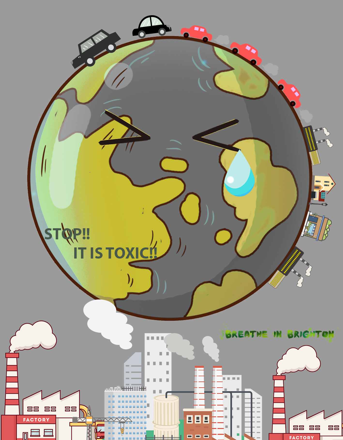
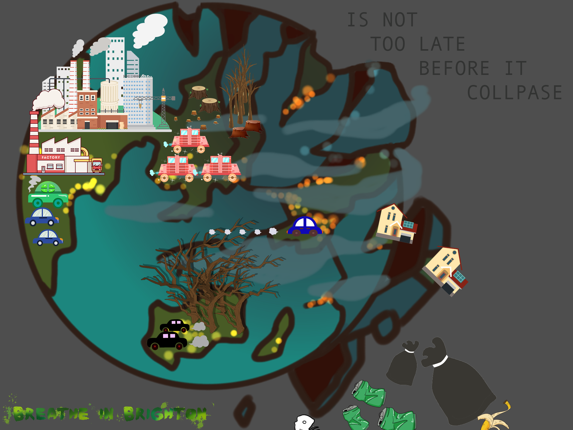
The Three poster i had done for the Breath in Brighton Campaign
The first poster is very simple contrasting the different between two world one is full of smog but other one is with greenery.
The second poster is fill up with the exhaust and the factory, therefore, the world turns into grey even dark.
The third poster is the earth is collapsing down because of the exhaust and air pollution.

FEED BACK FROM PEERS


EVALUATION
In my research is only target a small group of people in Brighton, the effective market is very tiny. The survey I had done for 32 people are mainly female they are the people mainly care about more the air pollution and the heathens. By the time i had done my research I had an idea of poster is from peoples view point needs to be shock and making a big contrast of the real world by using a cartoon image in the poster.
For my brand identity and selling point I think is quite successful, it brings up the idea of protecting the world by using less car, turn off your engine and air pollution is a big effect to the world. The cars with fossil fuel are releasing out exhaust it will effect child and elderly. On the visual codes I had use capital letter to make the slogan to stands out so people would be more easy to see it, and the words are more strong and powerful to attract peoples attention. All the poster I had use the mainly use dark colour is like the environment after it been polluted by the time, so give people an idea now is still have some time to fix the problem don’t wait till the time the world gone dark. But in the poster I had use the colour green to make a little contrast so it looks like is not till the end of the world yet.
To let more people get to know about this more the poster needs to be posted in a high population saw it, such as bus stop, train station or social media for the young people gets more idea of reduce air pollution.